
Paretify
Product Design, Web, B2B, Data Visualisation
Introduction
Overview
During my time studying at the IT University of Copenhagen, my class was selected by Paretify to brainstorm improvements for their web app.
Paretify conducts employee surveys for companies and creates visualizations to help understand perspectives from both sides to determine how balanced they are. My team's scope was to brainstorm how Paretify could improve the way they display results to users.
My Role
While working in a team of 5 people, I personally:
Created prototypes in Figma, ranging from low to high fidelity.
Brainstormed hypotheses to improve comprehension and engagement.
Conducted user interviews to identify pain points and needs.
Analyzed user feedback from prototypes and iterated on insights gathered.
Timeline
February - June 2024
research
Problem
Paretify's results page was not effectively conveying the necessary information.
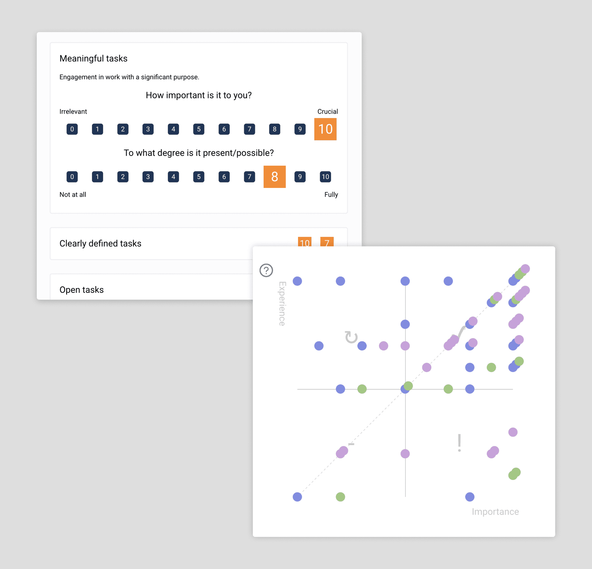
Their old implementation presented results using a 2x2 matrix, which required significant cognitive effort to interpret. This often overwhelmed users and failed to effectively convey the idea of "balance". If users are unable to comprehend or gain insights from the results, it defeats the purpose of conducting surveys entirely.
The Business
Paretify is an HR technology company. Their goal is to allow businesses to clearly understand employee experiences and feedback by collecting data through a new way of surveying.
It has some big name competitors such as Qualtrics EmployeeXM or Workday Peakon that both try to allow companies to get broad understandings of areas in which employees are struggling. Paretify's main goal is to help merge company policy with employee experience. They want to position themselves as a lightweight, easily adoptable alternative that companies can use without massive amounts of onboarding and HR personnel.

The goal of these surveys is to help both companies and individuals understand what areas they can grow in. We were tasked with brainstorming a redesign for the results page, reimagining how to present the data to optimize users' understanding. A word that kept on being brought up was "Balance", and so that became the focus of our redesign.
User Feedback
It took a long time for me to understand what each section of the graph meant.
Our employees struggled to understand key takeaways from the survey results.
I wish the results would give me tangible insights about my experience.
By talking to the founders, and going over entries of user feedback that they received, we tried to understand what they and the users cared about about and had issues with. We found three reoccurring issues that users were having:
Users struggle to understand the 2x2 matrix and what each section represents.
Users find it difficult to extract meaningful insights from the results.
Users feel there is no real reason to engage with the results.
Focus Areas
From the insights we gathered through the user feedback we determined three key areas to focus on:
Hypothesis
By replacing the existing graphic with a visualization that better represents the concept of "Balance", integrating AI-generated summaries to explain insights, and adding ways for users to interact with and explore the results, we believed users would better understand and engage with the product.
Final Design Preview
Here is a side-by-side of Paretify's old results page next to our redesign. Let me walk you through how we got there.
Design Iterations
Summary
While focusing on our key areas of interest, we conducted 2 phases of user testing, by having random users interact with versions of our prototypes. We had users navigate through the interfaces, sometimes comparing 2, while asking them questions about specific elements we were focusing on and gathering general feedback on how the used the interface and their satisfaction.
Graphic Representations
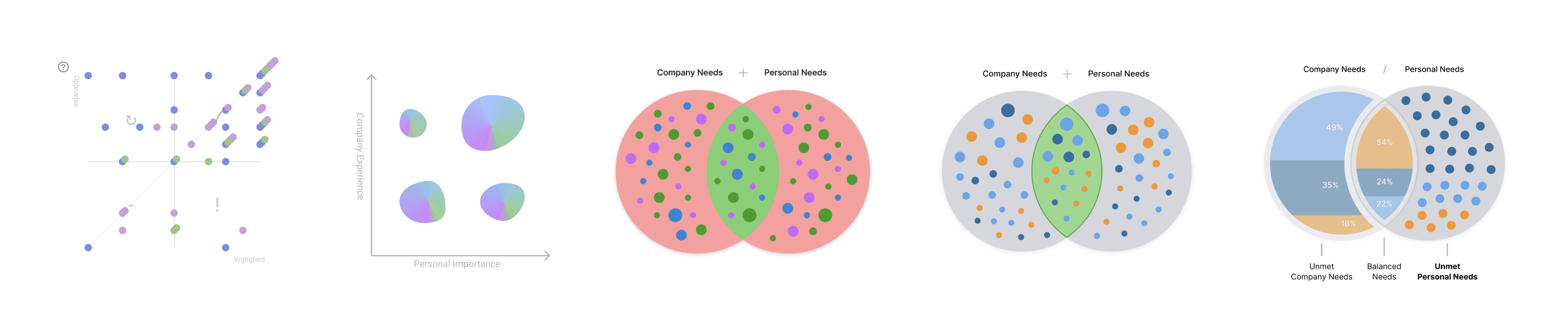
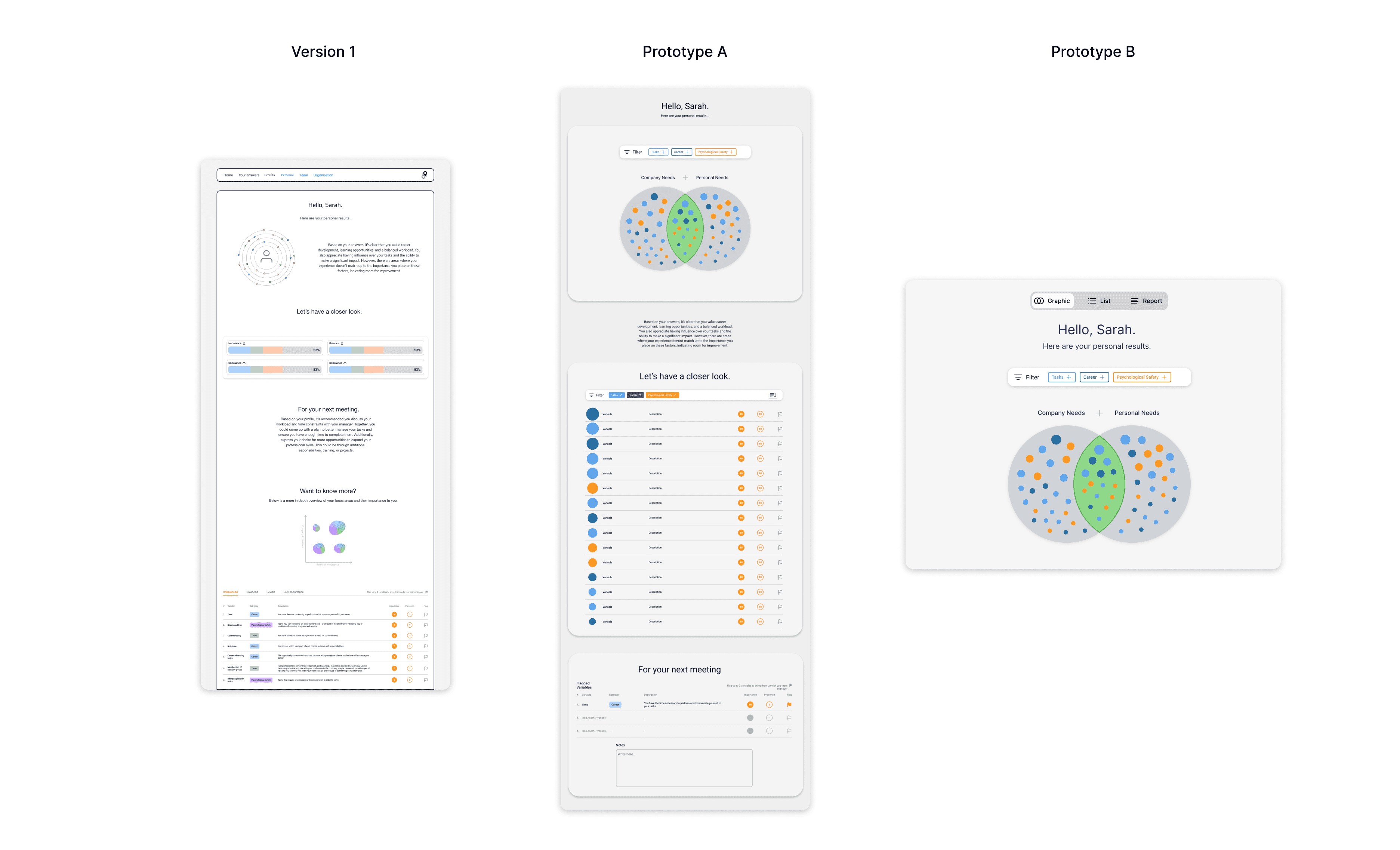
Paretify's original implementation used a 2x2 matrix (top left figure). From the user feedback, we chose to move away from that style of graph and settled on a Venn Diagram to better convey the idea of "balance" to users.
The founders liked using dots as visual indicators for the individual variables, but we found that users consistently found them too ornamental and distracting. We settled on a cleaner representation, dividing sections by survey category and highlighting the balanced metric underneath.
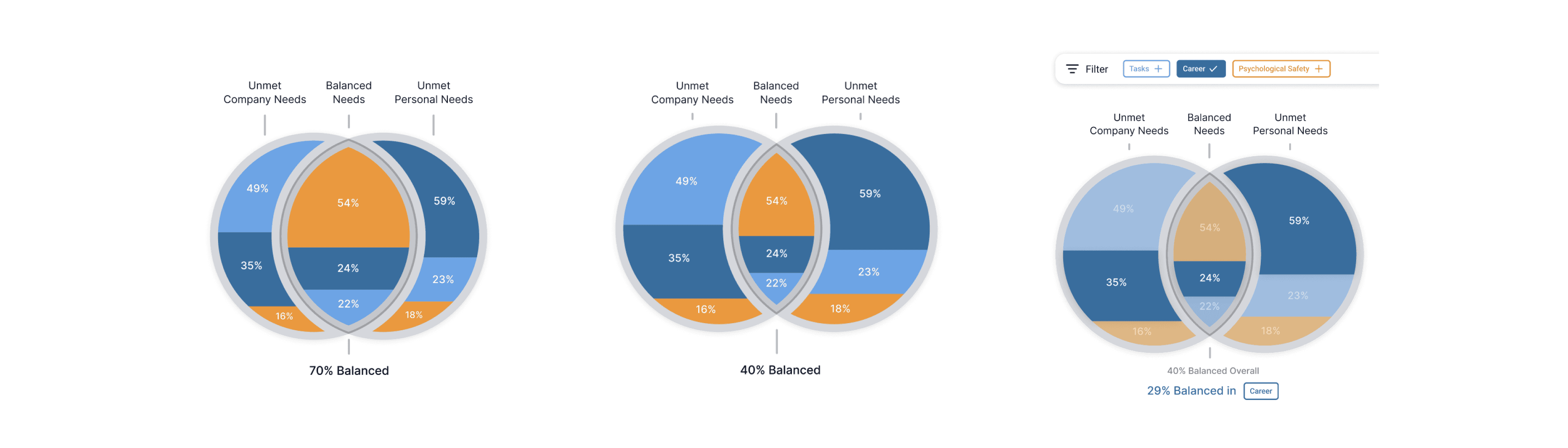
We explored different ways the graph could adapt depending on the results, finally deciding that the graphs should slightly overlap more or less based on how balanced the employee is with the company, with the percentage displayed underneath.
Page Layout
The goal of the summaries was to help users understand and be able to take away meaning from the results of the surveys. We thought of it as supplementing the graph visualization so we played around with different ways these text summaries could be implemented around the graphics.
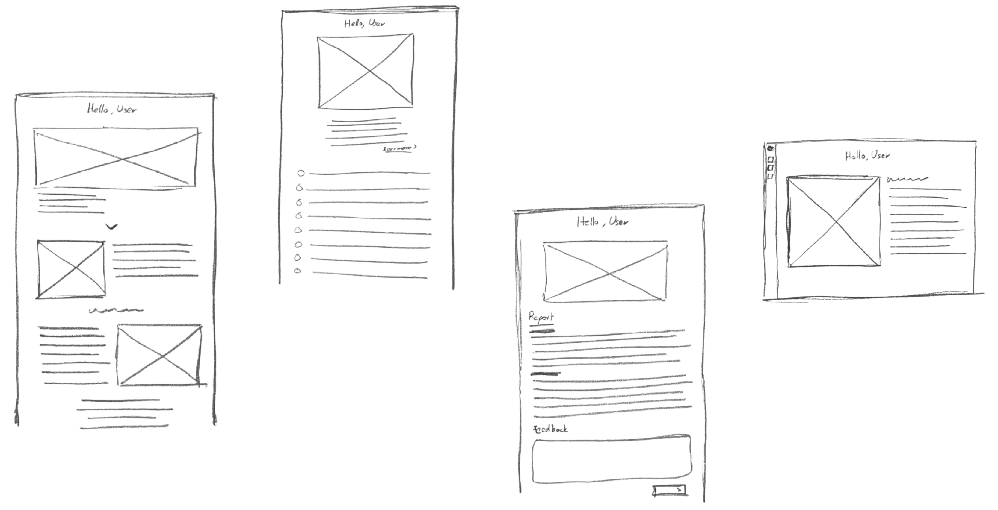
Through this exploration, we started to brainstorm general layouts we could implement. Our initial idea was having a long page with graphics and information visualizations dispersed throughout bits of text that would summarize the results. We moved on from that to having two prototypes which incorporated three different sections: the graphic, the list, and feedback. One prototype had these sections laid out on a singular page and the other had them on separate pages that users could navigate between.
To test our prototypes we interviewed 11 random students while having them try both prototypes A and B. Two key insights emerged from the feedback:
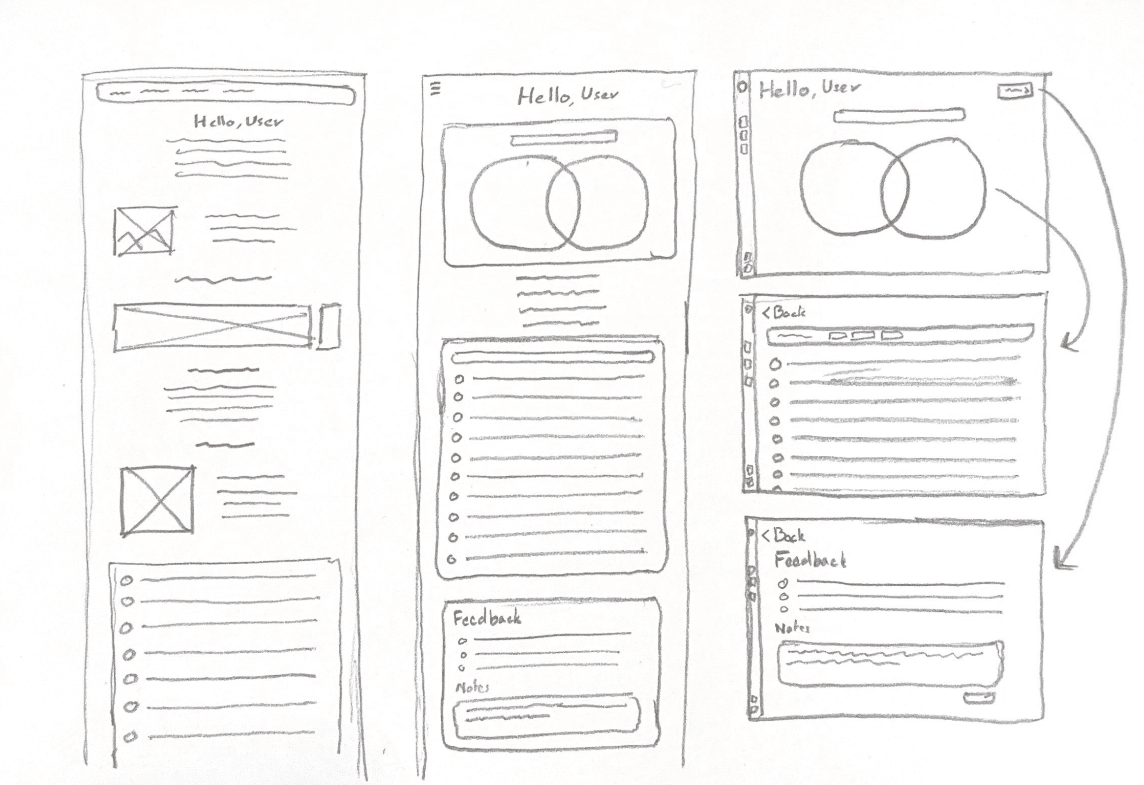
Navigation

Main Page

List Subpage
Focus Areas Subpage
For our second round of testing, we created a fleshed out prototype with three separate pages for the graphic, the list and a feedback page. Our main goal was to test out a bold way of navigating through the results
Users could then click on a specific section of the graph to bring them to a more detailed list view of the results for that section. They could at all times access the "Focus Areas" page to provide feedback about their results and see a detailed report.
We tested the new prototype on 5 of the same people and 4 new students. From that exploration we gained insights to iterate on a final version.

We shifted the interface away from having the distinct pages and created this homepage with the essential elements from each.
User Actions
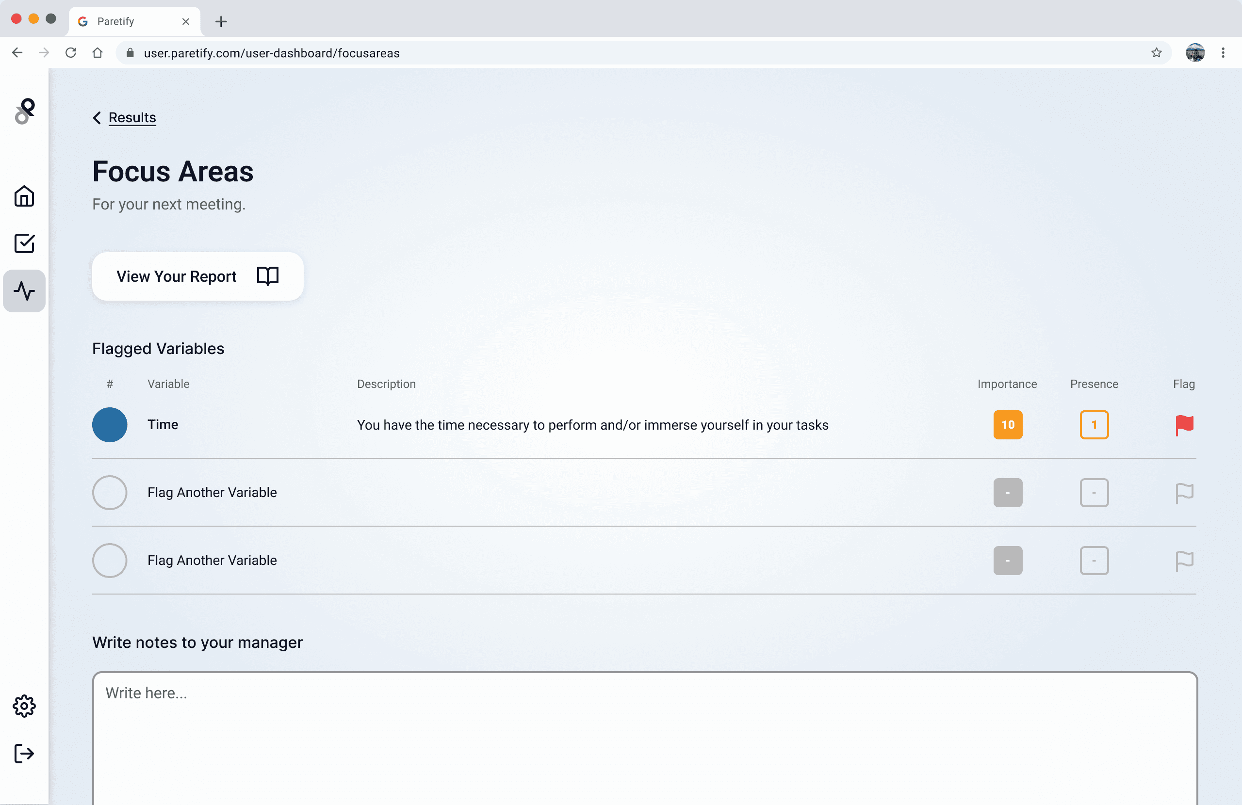
One of our main goals was to allow people to play around with the data. We grouped the data controls into this singular control bar.
Users can sort and filter data, allowing them to find variables they see as important and encouraging interaction with the page as a whole. The primary action users can perform is flagging important variables, which brings us to the "Result Insights".
Result Insights
Initial Prototype:
Directly from the homepage, users were able to interact with the graphic through the filter bar. With the summary at the side, it would allow users to quickly get insights, adapting to the category they are focused on.
Final Prototype:

With this update, users could still quickly read general insights but also learned about the action of flagging variable. Users could now quickly understand where the insights and flagged variables would be in they needed to access it in more depth.

When clicked "See more" users would be brought to a page with the insights expanded to showcase each category, allowing them to quickly scan, and then focus on one specific category if needed.
Final Design Deliverable

For our final design we simplified the user flow by moving the lists directly to the front page and pivoted the "Focus Area" page to "Result Insights". We pinned the flagged variables to the front of the insights panel and highlighted summaries inside the page for users who wanted to dive deeper.

Paretify’s goal is to foster growth between employees and companies. The "Result Insights" act as a way to give users a purpose when exploring their results. Users can view a detailed report of their results and see flagged variables. They can also write and attach messages about the results or highlight things they want to discuss in their next one-on-one meeting with their manager.
This page serves as a recap of the results and as a bridge connecting employees and managers, ensuring everyone can be aligned.